Graphics in MsPASS#
Overview#
Data visualization, in general, and graphics to visualize seismic data, in particular, are critical elements to understand data and the result of a processing workflow. On the other hand, because of the importance of graphical presentation there are a huge number of packages available today to create various types of graphics. The main goal of MsPASS is a framework to support parallel processing to make previously unfeasible data sets and/or algorithms feasible. Consequently, in our initial development we aimed to provide only basic support for graphics of native data types. Users should understand that custom graphics beyond our basic support support is the user’s responsibility. Because of the large number of options in existence we believe that is reasonable compromise with finite resources.
The current support for graphics has three component.
The lowest level support is to use the commonly used package called matplotlib. Because the sample arrays of all seismic objects act like numpy arrays that is often the simplest mechanism to make a quick plot. The basics of that approach are described below.
We have plotting classes called
SeismicPlotterandSectionPlotterto plot our native data types.As noted elsewhere a core component of MsPASS are fast conversions routines to and from obspy’s native data types (
TraceandStream). That is relevant because obspy’s native data types have integrated plot methods that produce wiggle trace plots of seismic data using the matplotlib library. That is an alternative to making custom matplotlib plots from primitives - item 1.
Matplotlib graphics#
Because data vectors of
TimeSeries and
Seismogram objects
act like numpy arrays the symbol defining the data vector
can be passed directly to matplotlib low-level plotters.
Here, for example, is a code fragment that would plot the
data in a TimeSeries object
with a simple wiggle plot and a time axis with 0 defined as start time.
import matplotlib.pyplot as plt
import numpy as np
... other code here to define d as a TimeSeries ...
d_shifted = ator(d,d.t0)
t=np.zeros(d_shifted.npts)
for i in range(d_shifted.npts):
  t[i] = d_shifted.time()
plt.plot(t,d_shifted.data)
plt.show()
Similarly, one way to plot a mspasspy.ccore.seismic.Seismogram
object is the following with subplots:
import matplotlib.pyplot as plt
import numpy as np
... other code here to define d as a TimeSeries ...
d_shifted = ator(d,d.t0)
t=np.zeros(d_shifted.npts)
for i in range(d_shifted.npts):
  t[i] = d_shifted.time()
fig,ax = plt.subplots(3)
for i in range(3):
  ax[i].plot(t,d_shifted.data[i,:])
plt.show()
A few comments about these examples:
Both use the ator method to shift the time base so 0 is the data starttime. Without that step the time axis would be useless as it would be in epoch times, which are huge numbers.
Both define the time axis manually using a loop and the
timemethod common to bothTimeSeriesandSeismogram. We have considered adding atime_axismethod to the API, but the example shows it would be so trivial we viewed it unnecessary baggage for the API.Note there are many options in matplotlib that could be used to enhance this plot. e.g. axis labels, a title, using UTC dates strings for the time axis for long records, different symbol styles, etc. The point is that for custom plots matplotlib provides all the tools you are likely to need. In fact, the MsPASS graphics module itself uses matplotlib.
Native Graphics#
The goal of the graphics module in MsPASS was to
provide simple tools to plot native data types. We thousands first remind
the user what is considered “native data” in MsPASS. They are:
(1) TimeSeries objects are scalar, uniformly sampled seismic
seismic signals (a single channel), (2) Seismogram objects are
bundled three-component seismic data, and (3) TimeSeriesEnsemble and
SeismogramEnsemble objects are logical groupings of the two
“atomic” objects in their names.
The second issue is what types of plots are most essential? Our core graphics support two plot conventions:
SeismicPlotterplots data in the standard convention used to plot nearly all earthquake data.SeismicPlotterplots data with time as the x (horizontal axis).SectionPlotterplots data in the standard convention for seismic reflection data. Because with seismic reflection data normal moveout corrected time is a proxy for depth it is universal to plot time as the y axis (vertical) and running backward from the normal mathematical graphic convention. i.e. time is always plotted with 0 at the top of the plot and the longest travel time at the bottom of the plot.
There are also a number of common ways to plot seismic data. Our graphics classes support the four most common methods:
Many seismologists prefer the simple
wiggle trace (wt)plot for displaying earthquake signals. As the name implies the plot is a line graphic of the signal.The traditional standard plot method for reflection data is usually called a
wiggle trace variable area (wtva)plot. As the name implies such plots are first a wiggle trace plot, but the plot adds a “variable area”. The “variable area” term means you fill positive values with a color. Traditional plots from past when paper records were the norm is black but other colors are common in published papers today. Our plotting classes allow changing the fill to any color.image plot (img)graphics have been the norm in plotting reflection data since at least the 1990s. An image plot uses a color map scaled by amplitude. These plots are most appropriate for data that are like modern reflection data: the data density is high and there is a strong correlation between signals plotted side-by-side.The most complicated plot is what we call a
wiggle trace variable area with image overlay (wtvaimg)plot. The best way to understand this plot, and in fact is exactly how it is produced, is first plot the data as an image plot and then overlay a wiggle trace variable area plot. It is most appropriate for data that have similar waveforms but have a density low enough to resolve the individual wiggle traces.
Below are examples of all four types of plots from our graphics tutorial.
For details of the API and how to use our plotting capabilities is
to run that tutorial and review the sphynx documentation on the
mspasspy.graphics module.
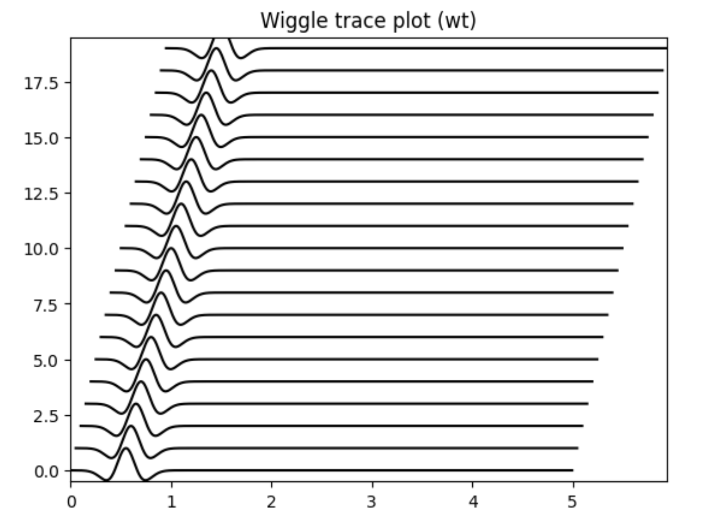
Fig. 14 Figure 1. Example of wiggle trace plot created by
mspasspy.graphics.SeismicPlotter. This type of plot
is created with the “style” set to “wt”.
(Set with mspasspy.graphics.SeismicPlotter.change_style() method)#
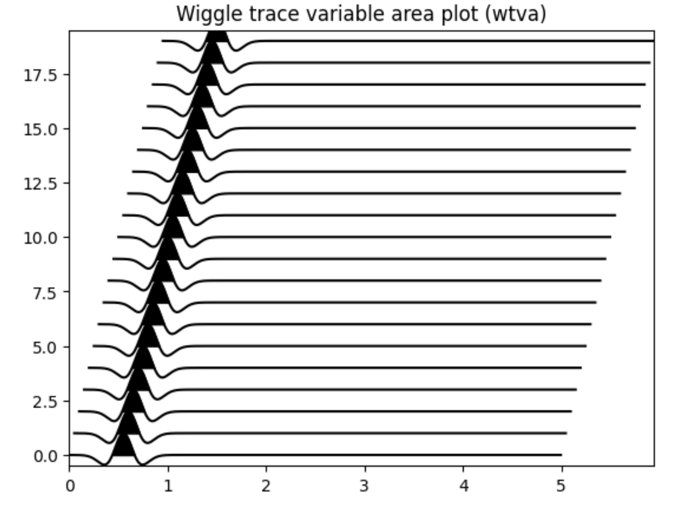
Fig. 15 Figure 2. Example of wiggle variable area trace plot created by
mspasspy.graphics.SeismicPlotter. The data plotted
are the same as Figure 1. This type of plot
is created with the “style” set to “wtva”
(Set with mspasspy.graphics.SeismicPlotter.change_style() method)#
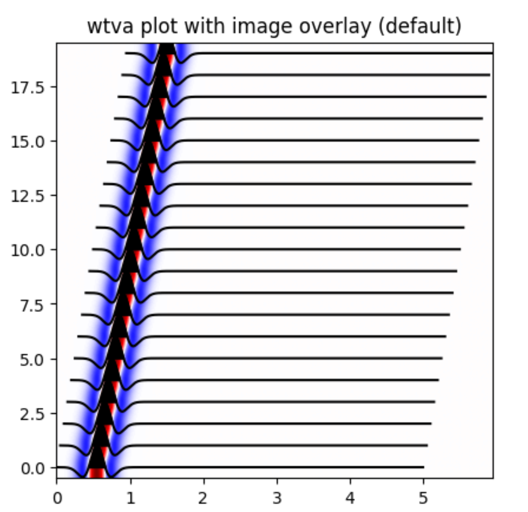
Fig. 16 Figure 3. Example of wiggle trace variable area with an image overlay created by
mspasspy.graphics.SeismicPlotter. The data plotted
are the same as Figure 1. This type of plot
is created with the “style” set to “wtvaimg”.
(Set with mspasspy.graphics.SeismicPlotter.change_style() method)#
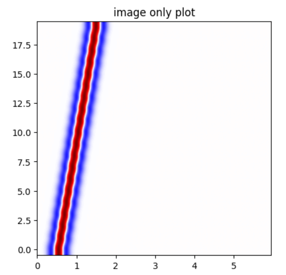
Fig. 17 Figure 4. Example of image plot created by
mspasspy.graphics.SeismicPlotter. The data plotted
are the same as Figure 1. This type of plot
is created with the “style” set to “img”.
(Set with mspasspy.graphics.SeismicPlotter.change_style() method)#
Finally, we would note that the plotters automatically handle switching to plot all the standard MsPASS data objects. Some implementation details we note are:
TimeSeriesdata generate one plot frame with a time axis and a y axis of amplitude.Seismogramdata are displayed on one plot frame. The three components are plotted at equal y intervals in SeismicPlotter (equal x intervals in SectionPlotter) with the x1, x2, x3 components arranged from the bottom up (left to right for SectionPlotter). There is an option for both types of plots to reverse the order.TimeSeriesEnsmbledata in a SeismicPlotter plot are plotted at equal intervals from the bottom up (i.e. member[0] is at the bottom) of the plot and the last member is a the top. Similarly, the SectionPlotter plots members at equal intervals ordered from left to right. As with the Seismogram plot the order can be flipped. We currently have no support for variable spacing of plots used, for example, to plot record sections. We recommend using other packages for that purpose.SeismogramEnsembleshave the most variance in how they could be plotted. We chose to always plot such data in three different windows. The graphic for each component is actually done using a same method as that for plotting a TimeSeriesEnsemble. i.e. the plots generated to plot a SeismogramEnsemble are three instances of plots for TimeSeriesEnsemble data - one for each component.
A final point is that any plotting of earthquake data nearly always
requires some form of scaling to prevent some data from clipping while others
will look like flat lines even if they contain valid data. The technical reason
is that the dynamic range of any graphics devices is tiny compared to that
of modern digital data acquisition systems (about 8 bits for graphics compared
to 24 bit acquisition that is now the norm for earthquake data). There is
an internal scaling parameter that can be used for all graphics, but the
internal scaling is inflexible. If the default scaling proves inadequate
use one of the functions for data scaling in
mspasspy.ccore.algorithms.amplitudes.
Obspy Graphics#
User’s familiar with obspy may, in come cases, prefer to utilize obspy’s
built in graphics. Obspy’s data objects
(Trace
and
Stream)
have a plot method as a member of the data object. MsPASS has
a suite of converters between obspy and MsPASS data objects.
These converters can be used in plotting scrips like the following:
# Something above created d as a TimeSeriesEnsemble
d_obspy=TimeSeriesEnsemble2Stream(d)
d_obspy.plot()
Extending MsPASS Graphics#
As noted at the beginning of this section the graphics available in MsPASS are simple by design. If you need different graphics capabilities you have three different options we are aware of:
Use the matplotlib approach and use one of the many features of matplotlib to create a custom plot.
Extend the SectionPlotter or SeismicPlotter classes using python’s inheritance mechanism. If you look under the hood you will find that both classes use matplotlib as noted earlier. Although the top level
plotmethod returns nothing, the internal methods that function uses all return a matplotlib handle. Many extensions of our graphics could be implemented by using those plot handles and using additional matplotlib functions to decorate the graphic or create GUI extensions.Export the subset of your dataset you want to plot and use a different graphics package to make the graphic you need.